Original "Think Later" Brand Context
To begin the re-design, I analyzed the existing Think Later visual identity, which centers on contemporary fashion and direct eye contact. This reference served as the baseline for the project, allowing me to identify the "subtle elements" the artist usually employs. Understanding the starting point was vital for ensuring that the radical shift into a 1950s fantasy world still felt authentically connected to the artist's persona.
Developing Brand Systems
This project chronicles the development of a cinematic brand identity for Tate McRae, evolving from abstract emotional themes into a cohesive "Old Hollywood" monster movie aesthetic. By deconstructing heartbreak into a visual vocabulary of "soft" emotions protected by "tough" metallic armor, I established a narrative where the artist outgrows betrayal through a "Giant vs. Dwarf" metaphor. This concept was refined through sketches that utilize scale and negative space to emphasize dominance over a crumbling world, culminating in an interactive LP packaging design. The final product guides the user through a storytelling experience, using a curtain-reveal transition to move from the vulnerability of "still caring" to the empowered independence of "finally not."
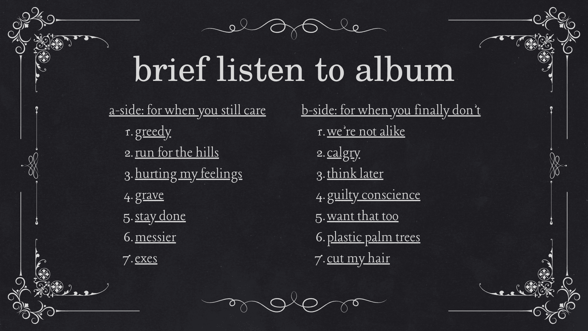
Brief Listen: Conceptual Tracklist
The tracklist was curated and split into two distinct emotional halves: "For when you still care" and "For when you finally don't." By assigning specific songs to the A-side and B-side, I created a curated listening experience that mirrors the visual transition from gray-scale heartbreak to "reckless red" independence. This intentional organization ensures that the sonic journey of the album is perfectly synchronized with the physical design and interactive packaging.
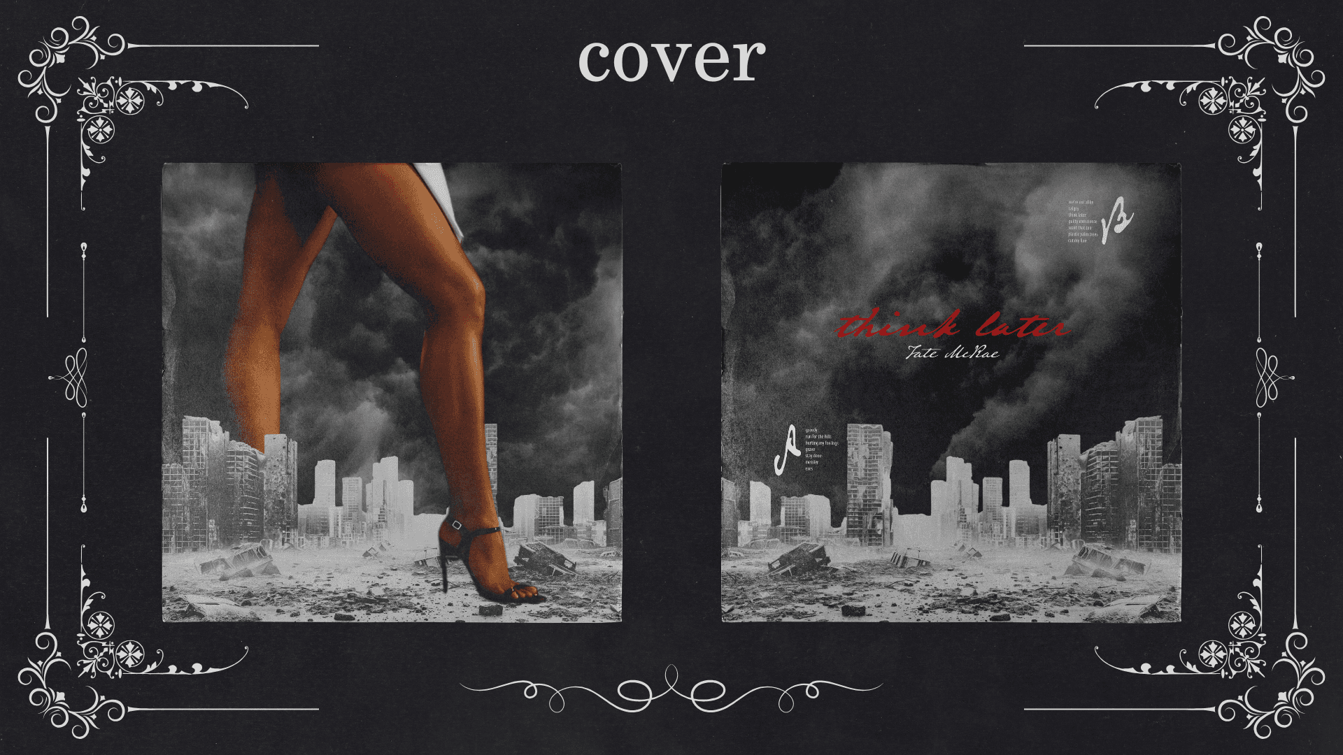
Cover: Front & Back
The full cover spread reinforces the 1950s Godzilla inspiration, utilizing a grainy, high-contrast texture to create a dark fantasy world. The front cover focuses on the symbolic strength of the artist's legs as she towers over a crumbling city, while the back cover uses "Old Font" typography and a "Think Later" tagline to embrace the consequences of her actions. Together, they form a cohesive "world-built" identity that feels both larger-than-life and deeply personal.
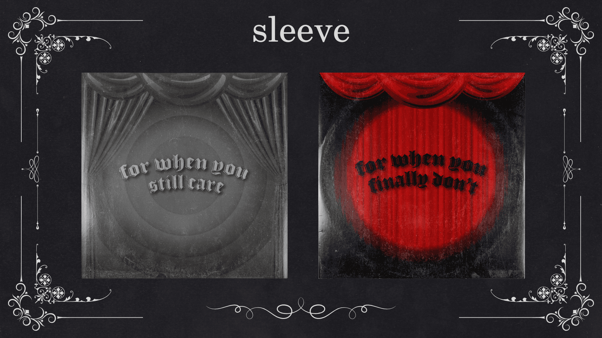
Sleeve Design
The dust sleeves serve as a narrative threshold, utilizing "Old Hollywood" theater motifs to guide the listener through an emotional arc. The grayscale "still care" sleeve represents the muted, cinematic past, while the vibrant "reckless red" spotlight on the "finally don't" sleeve signals a shift toward empowerment and bold independence. This interactive element transforms the physical act of removing the record into a symbolic "opening of the curtains" on a new chapter of the artist’s life.
Vinyl Disc
The vinyl pressing is the literal heart of the project, featuring a mechanical, "armored" heart motif that evolves from Side A to Side B. The transition from classic black wax to a striking translucent red mirrors the album's core theme: moving from a void of betrayal to a state of reckless, passionate healing. These discs act as a tactile representation of the "tough outside armor" discussed in the early sketches, protecting the soft, emotional core of the music within.
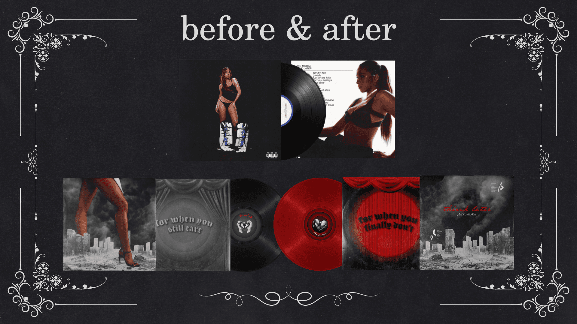
Before & After Comparison
This side-by-side comparison highlights the shift from Tate McRae’s original, minimalist athletic aesthetic to a high-concept, cinematic narrative. While the original design relies on a static studio portrait, my re-imagination introduces world-building and symbolism through scale, perspective, and color theory. This visual evolution demonstrates a move from standard artist modeling to an immersive "LP Experience" that tells a story across every physical component.
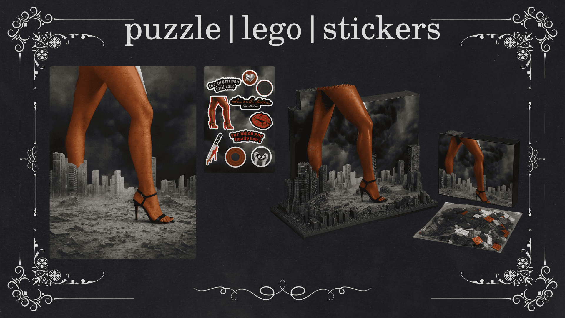
Interactive products & billboards
The merchandise and billboard campaigns transition the "giant" motif from a conceptual fantasy into a tangible reality, creating a comprehensive lifestyle ecosystem for the album cycle. Through interactive products like Lego sets and puzzles, fans are invited to engage in "world-building," while collectible stickers of knives and broken hearts transform symbols of betrayal into icons of resilience. This narrative scale is further amplified by billboard placements that use massive, architectural proportions to make the artist’s dominance feel literal and unavoidable, effectively turning the real-world environment into a stage for her newfound strength.